First, lets look at the past. We start with Tulips. I am sure everyone knows the story of Tulip Mania, so I will not go into detail regarding what happened.
This chart shows what happened to the price of Tulips between 1634 and 1637. That a long, long time ago, although it forms the basis of my observation. It can be seen a a prime example of human nature perhaps, the tendency for people to go a little crazy at times when greed and fear start taking over. Clearly this was a bubble that formed from the euphoria that reigned at the time, and inevitably popped when people realised 'hey, these are just flowers..'.
The next example of a bubble is the South Sea Company bubble that formed and popped between 1719 and 1722. Again euphoria took hold and again it ended badly.
These are more recent examples that show the Nikkei, the Nasdaq and the DOW during the .com bubble. Again people became euphoric about something and later realised 'hey, these are just websites...', which inevitably lead to the popping of the bubble.
Alright so now we have a few historic examples of how these things have played out in the past. Let's look at the psychology behind these bubbles.
This chart does well to indicate the different states that people are in when these bubbles form and inevitably pop. It is important for us, here, to take note of the Blow off Phase and the Bull Trap and Return to 'normal' stages.
Now let's look at Bitcoin's chart.
The first chart looks are Bitcoins versus the .com bubble. The similarity in the charts should be evident.
These two charts compare the typical bubble chart to the Bitcoin chart. Once again, the correlation here should be clear.
This chart shows the most recent picture we have of Bitcoin. It looks to me as if we are re-entering the Awareness Phase. We know these patterns of human behavior repeat themselves and thus can assume that Bitcoin will in due course push for another high. Time will tell how long it takes to go parabolic again, if at all.
I say 'patterns of human behavior', because that's all the stock market really is, isn't it? A place where humans interact with each other and allow their primal emotions to rule their actions. There is no such thing as a rational investor and ultimately sentiment drives markets. Anyway, I digress.
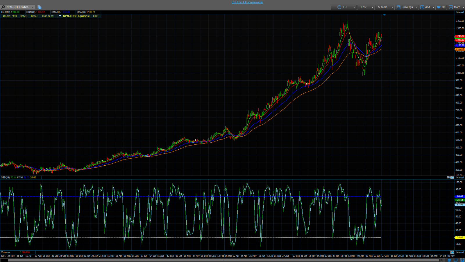
Now let's look at the Naspers chart.
Look familiar? Sure it does. To me anyway. This chart is from 2011 to 27 June 2014, roughly the same period of time as the examples from 1634 and 1719. It also looks like we are in the 'Return to normal' stage doesn't it?
There are no shortage of Naspers bears, or bulls for that matter. I am not saying that this is the beginning of the end either. I am just saying that it all looks terribly similar.
Opinions, thoughts and comments are welcomed! Please leave a comment below if you would like to add anything.
>Peace and love


.PNG)

Great read. I can always count on you to come up with something interesting
ReplyDeleteFood for thought!
ReplyDelete